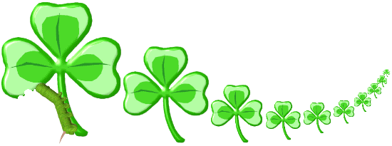
Not quite ready to do another animation just yet, St. Patrick's Day was the inspiration for "Clover Caterpillar." While the design looks pretty simple, it actually involved a lot of different steps to get to the finished product. The clover leaf was a Windows Metafile clip art image, which I altered, colored, and then made 3D using a program called La Fonta. It was then reduced numerous times in Batch Thumbs. The caterpillar was another clip art image that only had to be rotated and reduced, then combined with the other images.
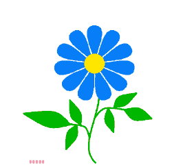
We were having a bad (or good, depending on your point of view) spring for caterpillars in our yard, with so many of the wee beasts that some of our smaller trees were completely defoliated as they started to leaf out. It was also a great spring for many flowers, so the following animation merely evolved from those ideas. The entire cartoon was drawn in MS Paint, except for the flower petals, which were designed using a "quick draw" function in Serif Draw Plus. After reductions in the size of the images and the color palette, and optimizing in a program called, appropriately, GIF Optimizer, the total size of the animation was reduced to a manageable number of kilobytes and "Super Cat" was born.
|
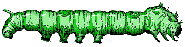
Sometimes a rather strange idea can result in a graphic for which nobody really needs to know the background. The following image began with the eggs, matching animated letters in the title in which the letters "hatched" out of eggshells. For some reason, I thought of green caterpillars and then of the Dr. Seuss book, Green Eggs and Ham. Twisting the words around resulted in "Green Cat and Eggs." The egg was a clip art illustration and the caterpillar was scanned from an old engraving, colored and given 3D effect, using various programs for each step.
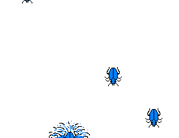
I love fireworks, especially the big colorful ones. The effect of watching these large displays from a distance has always fascinated me. When up close, the explosions seem to go slower than when seen from far away. I'm not sure which I prefer, they are just different experiences. The idea for "Bug Works" came from some bug stars that I created for our clipart site. I started with the existing graphic and then moved the bugs into the center and outwards to dissolve. The final effect was so neat that instead of just making 3 as I had intended, I made 6. The cityscape below started as a clipart line but I embellished it to make it more interesting. The separate animations are positioned using a table. Each image has a different number of frames and different timings so that they appear more random. In spite of the incongruous light background, I think the effect is rather good.
     
|
|
|
I think the creative fount dried up after my last effort so the next graphic is pretty simple. "Lime Bugs" started as a freeware font by Jeffrey N. Levine. Using Ulead Photo Express, I simply used several of the "letters," added 3D and shadow effects, and mirrored the images. The colors and texture matched the letters of the heading.
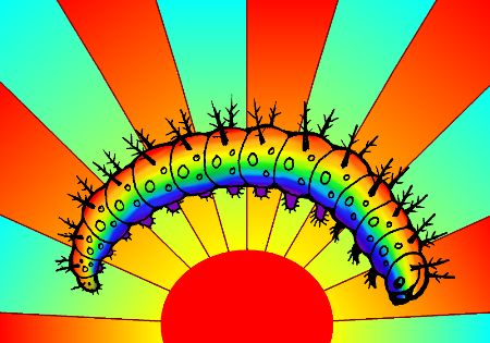
The letters of the heading for the following issue were a brilliant gold and I wanted an equally bright image to match, hence "Rainbow Cat at Sunset." The caterpillar was hand drawn (after the larva of the Gulf fritillary butterfly) and scanned in. Colors for the background sunset were added in Microsoft Word, while the rainbow on the bug was created in paint, then blurred in MS Photo Editor. For such a simple result, I often use an embarrassing number of different programs. At least it doesn't take very long.
The title came first on the next image. "Bug Bomb" is a composite of two different existing clipart images. The ladybug bomb began at the full size and I just reduced it over and over in MS Paint. Creating the trajectory was easy in a single graphic, that was then split up into separate frames. The final explosion was part of another animation.
 |
Whenever the Halloween edition of our newsletter rolls around, I enjoy giving vent to my delight in darker humor. "Into the Light" was conceived from an insect's viewpoint, as it heads into the mesmerizing blue light of an electric bug zapper, with pathetically predictable results. This idea actually came from a handheld bug zapper that we love to use on mosquitoes. The entire animation was drawn in Microsoft Paint. I liked the title so much that I included it right under the image.
 |
The color scheme for our November issue was purple, hence the unusual hue of the cicada larva in the next animation. This one was pretty simple. It used an existing tiny clipart bug and I moved its legs to imitate the staggering gait of the real creature. The title, "Persistence," is ambiguous; it can either refer to the animal or to the viewer who watches and waits for something more interesting to happen.
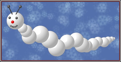
The idea for "Snow Worm" came to me long before I figured out how to realize it. The first problem was how to create a basically white graphic and make it show up on the white background of our newsletter. Then next was how to make it 3D. I solved the first by adding a background. The snowflakes are a serendipitous addition found in the options of my Ulead Photo Express program. A simple border gives the necessary frame. The 3D snowballs were created with Z Paint, a limited, but very useful little freeware program. It took a bit of practice to place them just right, but the final effect was just what I wanted. The facial features were added the same way. In one version of this graphic, I made the background move, but that created a file that was too large for practical web application.
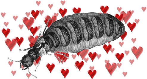
Once again, I came up with the name first, then had to figure out the execution. "Queen of Hearts" seemed like such a good Valentine's illustration that I was quite happy when I found an old engraving of a termite queen that would work. The hearts matched those used with the heading of that issue. Not sure how to combine the images I wanted, I resorted to finally trying to use the layers feature in Photoshop Elements (a program I'd received several months ago). This program is less intuitive and more complicated than the other graphics applications that I usually use, so I had to refer to the Help files a couple of times. Once I got the hang of it, the ease with which I could manipulate the various aspects of the layers made it worthwhile.
 |
Time for another animation. We'd had a lot of rain, and the shape of a beetle comes close to a raindrop. It wasn't much of a stretch to imagine "Bug Drops" but implementing the idea took me awhile. This is actually a single graphic shown twice, side by side. The whole thing was done using Microsoft Paint.
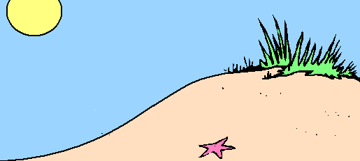
I'd just gotten back from an extended camping trip in southern Florida so beaches were on my mind. Insects are often found on the beach, usually having been blown there, or washed up; it is not a friendly environment for small non-aquatic creatures. Most of the elements of "Beach Bug" were found in various clip art collections, but the wave was hand drawn in MS Paint.
 |
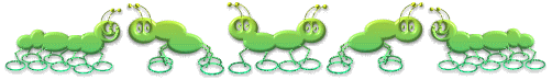
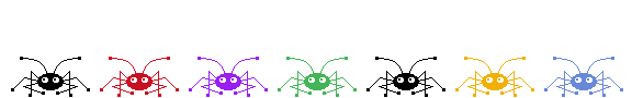
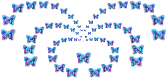
Our 5th anniversary issue called for a celebratory graphic and "Bug Dance" fit the bill. I got the basic idea for the shape of the bugs from a freeware dingbat font, but actually drew the individual bugs myself, using MS Paint. Creating several different poses gave me enough material with which to work, and I then made them leap vertically to give more interest. I turned them into different colors and used the timing on the animation frames to create the illusion of a rhythm.
The next animation, "Firefly vs. Lightning Bug," began as a verbal pun, since lightning bugs and fireflies are just two names for the same insect. It was only a matter of figuring out the best way to graphically illustrate the idea I had in mind. It turned out to be pretty easy, using the blur function in MS Photo Editor after creating the simple shapes with MS Paint. The timing on each frame added the finishing touches.
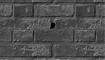
Because our newsletter comes out on the 21st of each month, I sometimes use holidays that will occur in the next month. Often, for the June issue, I create an Independence Day cartoon. However, I've done quite a number of those and so chose to highlight the Summer Solstice instead. It took awhile to figure out what I wanted to convey, since there is much mysticism and ritual applied to the lunar holidays. Wanting to play with the idea of the sunlight hitting a carefully chosen spot only once each year, I decided to strip away the solemn and sacred overtones, leaving just the mundane fact that some bugs avoid the light. It turned out to be more difficult to create the animation than I thought it would be. The brick wall is simply a clipart background. The hole was easy enough, with the 3D effect being done in a little program called Z Paint. Even making the light "grow" wasn't too complicated. However, the resulting graphic file size was too large, so I had to eliminate as many colors and frames as possible without degrading the quality too much. The bugs had to crawl out of the light area and end up in the darker part, which necessitated an adjustment of their coloration as well. In the end, it turned out to be a heavier graphic than I would like, but the effect was satisfactory.
 |
Having no intention of doing yet another animation, I planned on creating a static image. However, the idea came into my head of synchronized swimming, or water ballet, (who knows where these ideas come from?) and the animation just about made itself. "Whirligig Water Ballet" consists of one small animation copied numerous times to give the impression of more activity. The original bug image was one of my own clipart graphics, and I simply manipulated the insects in MS Paint. Having a GIF animator program like the Ulead GIF Animator Lite that I use is essential for working with the multiple frames and adjusting the timing of each. After the bandwidth gobbling graphic of last month, this one turned out satisfyingly lightweight.

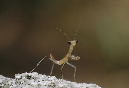
During a rather dry period in the creativity department, I simply chose a fetching picture I'd taken of a newly hatched baby mantis. This one is called "Welcome to the World."
The idea of the creativity fount drying up gave me the idea for the next image. "Rainbow Fountain" is nothing more than a little clipart doodad that matched the letters of the heading for that issue. A lot can be done with resizing and repetition.
The approaching Halloween issue was just what I needed to get back into animations. Although I didn't need to make this GIF transparent, it ended up optimizing to a smaller size than one with a white background. The GIF Optimizer program that I use works wonders, and I never know quite how much bandwidth usage it can shave off, but it always does pretty well, especially if I try both transparent and non-transparent versions. This one is called "Shadow Show."
 |
After several false starts on an animation for our next issue, I came up with "Weapons of Moth Destruction." It was drawn entirely in MS Paint, but is unusual in that it consists of two overlying files. The aromatic moth balls are on a background layer (which also happens to be transparent), with the rest of the image being a transparent normal animation. I knew that my pun probably wasn't original, but I was a bit surprised at how extensively it showed up on a Google search.
 |