 |
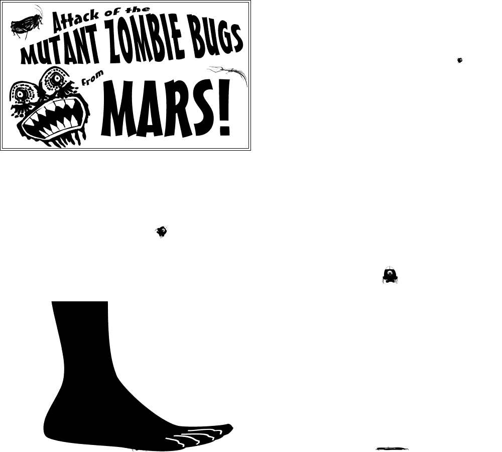
I was feeling a bit retro on the next issue, which I didn't realize until I saw the end result. It included an essay about the hometown where I grew up as well as old-style typeface for the newsletter header. So, too, the idea for "Attack of the Mutant Zombie Bugs from Mars!" comes from the old posters and ads for bad Sci-Fi movies that were far more intriguing than the actual films. False advertising is quite commonplace, but it is rarely so amusing. Remember the old comic book ads for Sea Monkeys?
 |
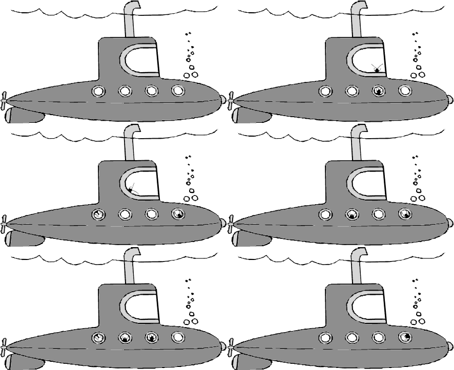
My husband, Larry, had been reading Boys in the Boat, AND he also really likes movies and books set in submarines, so it is obvious where the idea for "Bugs in the Boat" came from. The clipart submersible is not particularly to my liking, but I couldn't find anything better in a reasonable amount of time. I'm also not sure why I did not make the background of this one transparent. I probably just forgot. Although they look roach-like, the little insects are actually several different kinds of beetles.
 |
I often get into the idea of solstices and equinoxes when thinking about illustrations for the months containing those celestial events. It's easy to play with the outlandish creation myths of various cultures and invent new ones, especially with attractive dingbat font characters. The arthropod gods can be just as powerful as vertebrate entities. Maybe more so!
 |
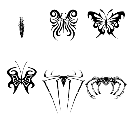
When I teach entomology classes, I often review the different kinds of metamorphosis, such as complete vs. incomplete. All arthropods molt several times throughout their lives and several kinds have variations amongst the details of their particular growth and development patterns. Because of the fantastic imagery for Halloween, it was easy to come up with "Extreme Metamorphosis."


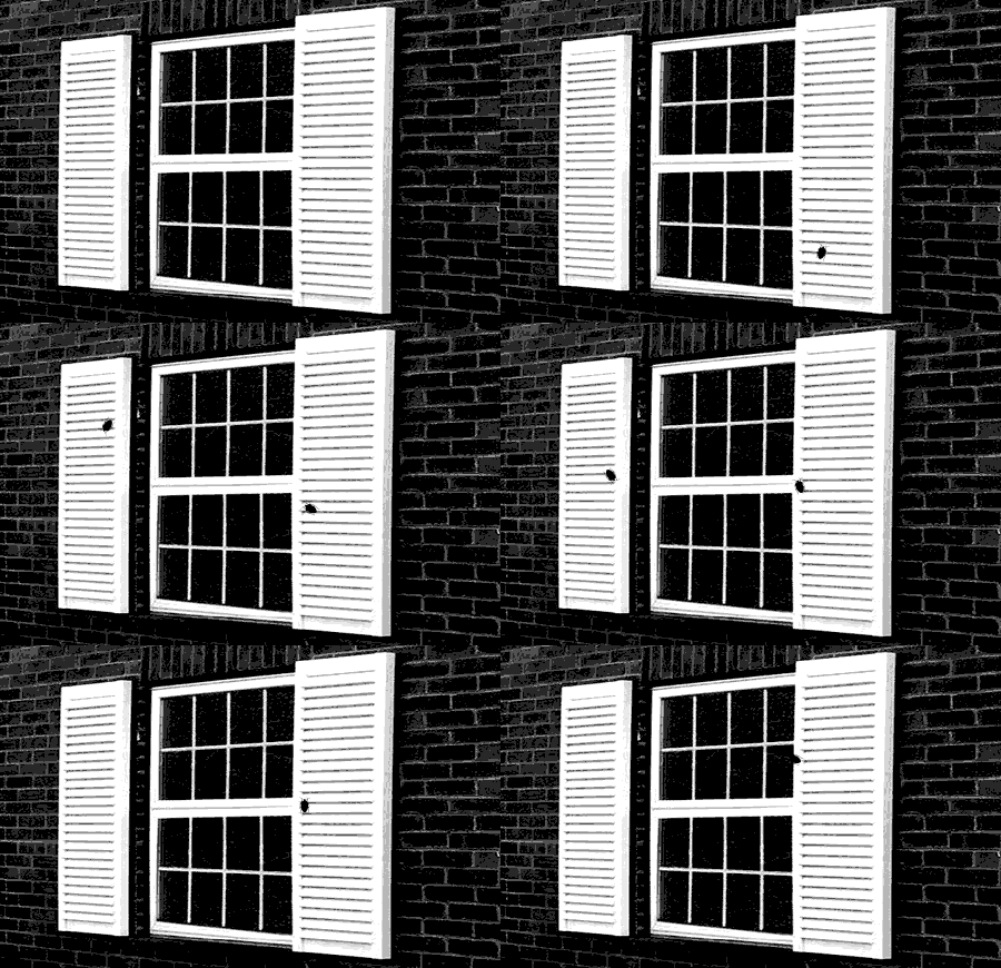
Just when I think I have exhausted all possible puns having to do with bugs, I find one more. Why didn't I think of "Shutter Bugs" before? After all, I am a photographer and have even contributed to an article in a scientific journal highlighting some of the discoveries made by amateur shutterbugs. The background of this one was a real photo. The bugs are just figments of imagination.
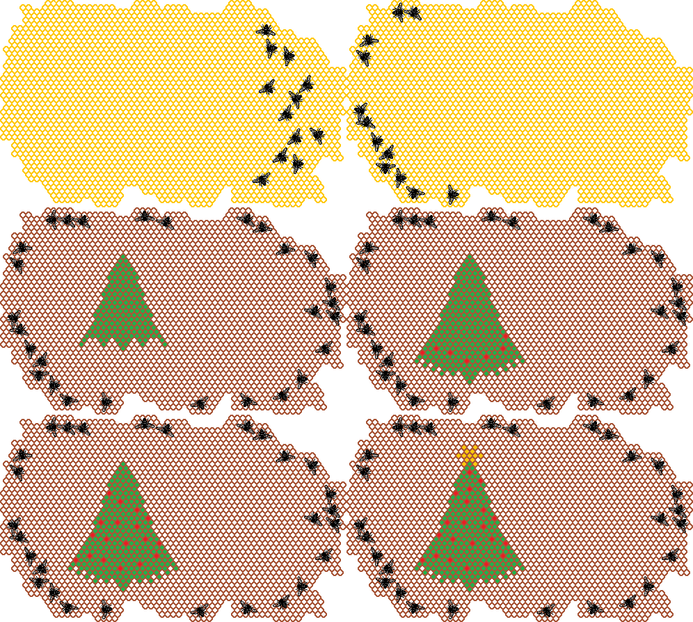
Remember the old Lite-Brite toy, with its back-lit plastic grid and clear colored plastic pegs? Yeah, I enjoyed that when I was a kid too. That's where the idea for "Honey Bee Holiday" comes from. For some reason, I only associate that toy with Christmas, maybe because of the colored lights, so it seemed perfect for translation to a honey bee hive, where the workers really NEVER have a holiday party. This one was more about the process of creation than the resulting graphic, which, in my opinion, sort of sucks. It was much better in my imagination.
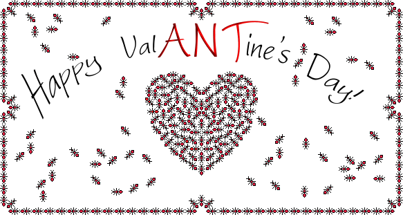
Okay, it's a rather silly pun, but "ValANTine" gave me the chance to once more play with my tiny pixelated insects. Created with MS Paint and Ulead Photo Express (for the text), I think the sort of creepy sensation created by all those bugs is actually quite effective. On another level, it's an attractive graphic.
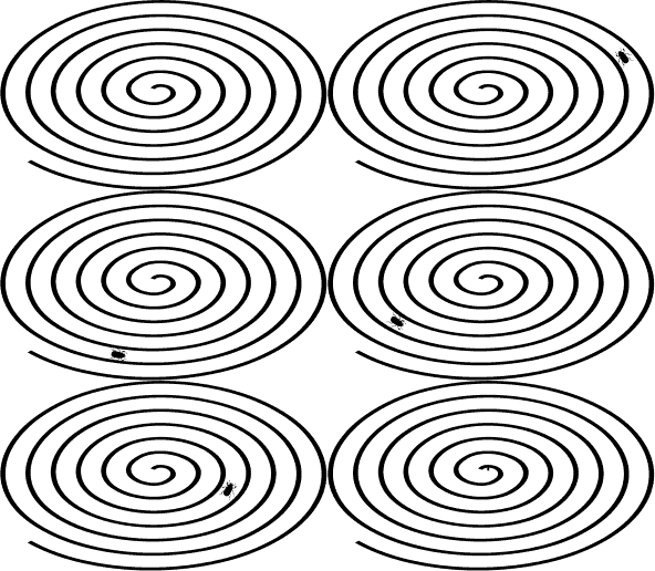
Sometimes the title is everything. I love the alliteration effect of "Sacred Scarab Serenity Spiral." The graphic was an easy one, but took some time to create all the frames - 426 to be exact! That is a record for me. Under some circumstances, that number of frames would be prohibitively bandwidth heavy, but in this case most of the frames are only as big as the insect itself, along with a very limited color palette. The spiral, of course, is a meditation technique. I would posit that so is creating over 400 frames that involve simply moving an image a few pixels.
 |
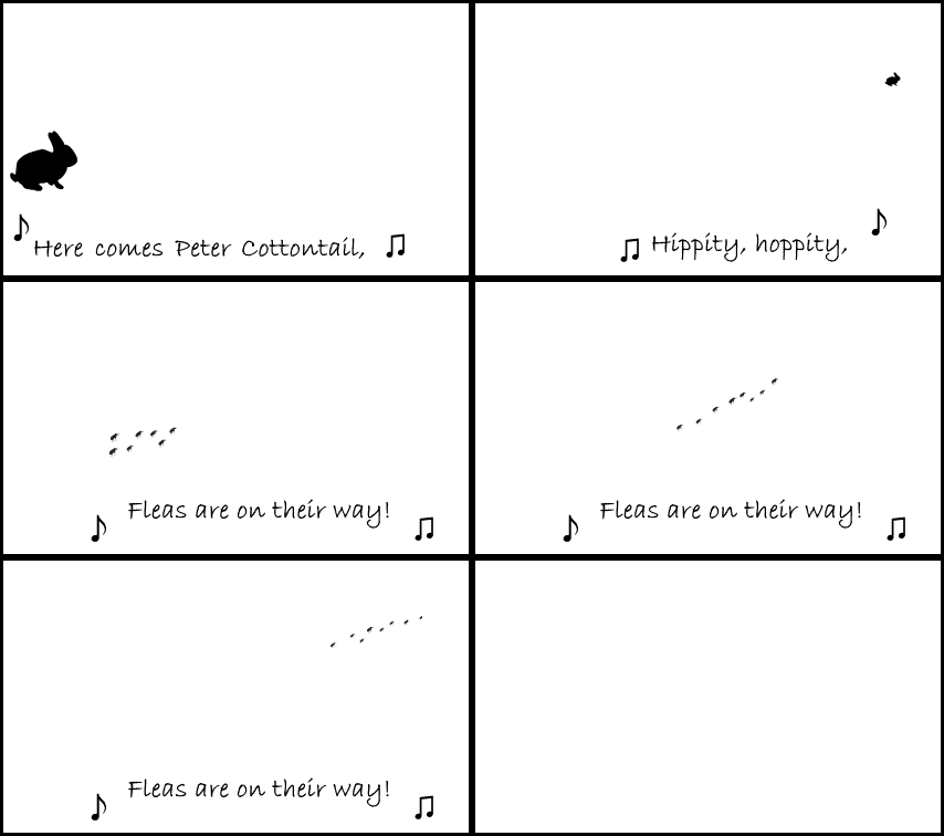
I usually keep my laptop speakers muted because I don't like unexpected noises such as beeps and silly notification chimes. Therefore, I never use sound in graphics either, even when it seems prudent. It's a bit more fun to use the mime technique of visually illustrating even auditory concepts, so I frequently make use of musical notes when I am implying a tune. A few words of a song such as this one will jog just about everyone's memory. "Easter Fleas" makes sense on two levels: the first that rabbits often host the pests and the second that our flea season here in the South begins around the time of Easter. I was lucky to find a dingbat font that included silhouetted rabbits in various poses, hence there was no need for me to draw my own bunnies.
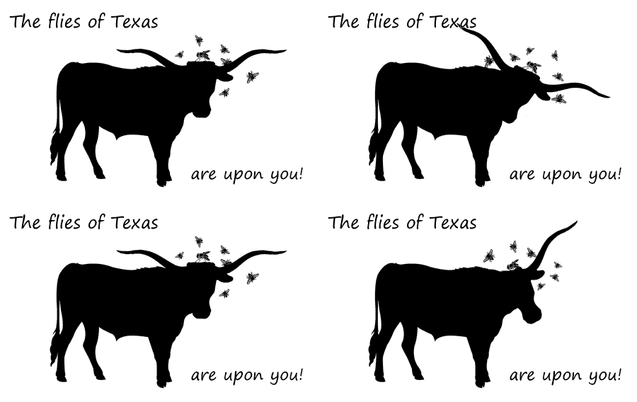
With pests and songs on my mind (see last month's graphic), I decided to carry the concept one step farther. Any University of Texas Longhorn fan will understand the references. Although I do not reproduce here the graphic letters I used on any particular month's newsletter, suffice to know they were burnt orange in color and had little pairs of eyes on each character. For those who know nothing of football, universities, or Texas, the Longhorn's mascot is Bevo and the song "Eyes of Texas" is sung to the tune of "I've Been Working on the Railroad." Everyone knows why flies are attracted to cattle.
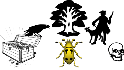
The next illustration has a curious story. Because of our "bug" theme, I often use puns on that idea. When "gold bug" came to mind, I wondered if I was remembering correctly that it was a term for a person who is bullish (yes, the cattle reference came from the last illustration - so much in life is intertwined...) on gold as an investment. Of course, I went to the omniscient Wizard of Google to see if I was accurate. I was, but I also discovered that Gold-Bug, with the hyphen, was a short story by Edgar Allen Poe. As a teenager, I discovered Poe's stories and poetry, and I really enjoyed the classic horror tales that I'd found in a couple of anthologies. I had not, however, heard of this particular story. That deficit was quickly remedied as I found the complete text online and read it anon. It turns out that it was the author's most commercially successful work and an early example of a detective story solved through a cryptogram that eventually leads to, of all things, a buried pirate's treasure. I absolutely LOVE learning new things and this was a classic case. The joy of discovery is but a mouse-click away.
The image is simply several clues and ideas from the story, including the raven reference to the author. For more information, I highly recommend reading the story, which is quite short, as the first half is the tale, and the second half, which you can either read or ignore, simply gives a step-by-step detailed description of how the characters solved the mystery.
By the time I did the next graphic, we were well into mosquito season, so "Mosquito's Dream" was a no-brainer. Again, the song on which it is based needs no audio because the words are so famous that just about everyone will hum the tune in their head. If not, look it up on YouTube. This is another composite of dingbat fonts and clip art.
|
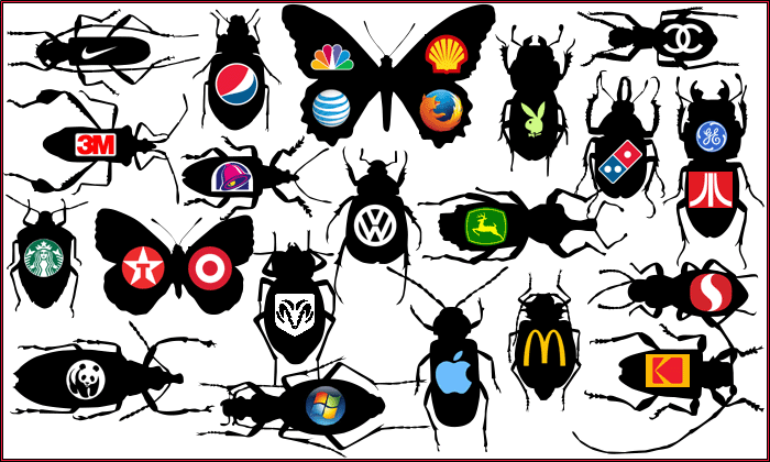
There is a small book called Naming Nature by Yoon in which I read that, like a specific part of our brain which recognizes faces, there is also a part that names living things (plants and animals). In the distant past, this was important as all our food comes from organic organisms; knowing how to tell them apart was crucial to survival. Well, nowadays many people don't know the identities of hundreds of animals, so Yoon suggests that we now use that section of our brains to recognize commercial product brands. I'm not sure whether I agree or not, but it is quite logical to assume that the ability to remember all sorts of symbols is related to memorizing the look of a poisonous vs. an edible leaf or fruit. Anyway, I realized that we DO recognize many companies by a simple graphic instead of a spelled-out name. I also like the look of a "cabinet of curiosities" sort of collection, which is what "Brand Name Bugs" is based on.
The big news in August, 2017, was the total solar eclipse that occurred across the United States. As I would have had to drive several hundred miles, then battle the traffic within the path of totality, I decided to forego the spectacle this time and will instead plan on viewing the next opportunity: an even longer totality will be visible in April, 2024, right here in Texas. I can't wait!
For some reason, solar eclipse seemed to tie in with Selenops (slightly reminiscent of an anagram? sort of? well, not really...) , which is a genus of spiders commonly called Flatties. The nice, round shape of the spider's legs, as it rests on a wall or rock face, is also very slightly similar to a starburst pattern. Sort of. Perhaps. Okay, it's pretty much just a free-associative idea, much like a typical dream image. They're my graphics and I can make up anything I want.
 |
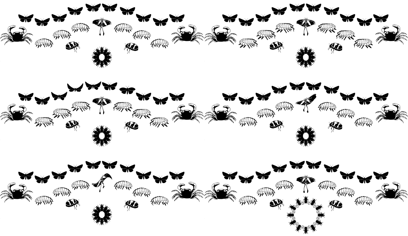
Making dingbat font characters morph and shift is sort of fun and that's the whole premise of "Chitin Chorus Line." For those not versed in biology lingo, chitin is what the exoskeleton of any arthropod is made of. I don't think my title really fits this particular animation, but it's good enough for an amateur endeavor like this. Maybe I'll try again in the future.
 |
Sometimes it's just fun to play around with PhotoShop. I use Elements 2, which, let's face it, does pretty much anything that I wish to do with these simple illustrations. I've been told the program won't work on later operating systems, but I am using it with Windows 10 now. It's fine. "Peri Meets Predator" was done for, you guessed it, the Halloween issue. Peri is short for Periwinkle, who is our beloved wire fox terrier. She really did react to the waves at Galveston with her typical hysterical intolerance for anything surprising or novel. There wasn't really a giant mantis emerging from the depths, though. I even tweaked the photo a bit more, removing the leash on which she is always restrained in public. Doesn't the red of her collar match that of the frame nicely?
 |
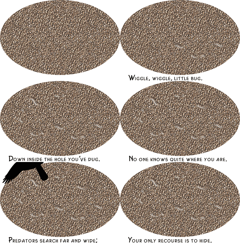
The poem for "Bug Survival" is sung to that incredibly versatile tune of "Twinkle, Twinkle, Little Star." Or it doesn't have to be. It works either way. The moving parts of the image are rather subtle, much as they would be in nature. My favorite part is when the bird shadow crosses over. I'm easily amused.
 |
In another case of limited options due to my not using sound for my computer graphics, you have to mentally sound out the utterances of the creature in "Humbug." I considered pairing it with a sheep giving its usual vocalization, but that seemed too blatant. I'll leave that part to the viewer's imagination. I can't believe I never thought of this pun in association with any Christmas in the past 18 years or so. Thank goodness I've not run out of ideas yet. The bug is a clipart entity representing a ventral view of some sort of aphid or other plant-feeding homopteran.

Perusing pictures from the Hubble Space Telescope of galaxies, nebulae, and planets, I decided that a little PhotoShop detailing could create a nice image for which the name would be obvious. "Dragonfly Nebula" did not turn out as well as I'd imagined, but it's also not too bad. The colors matched the graphic letters that I had used for the Valentine's issue, sort of like buying a painting because the hues match your sofa. I think I like the ring of the name better than the finished product.
 |
Ideas sometimes come to me in somewhat freely associative ways, which explains the next slightly enigmatic graphic. The title "Clockwork Bug" does refer to "Clockwork Orange" which is a horrible movie in my opinion as I hate needless violence and, actually, I've never seen the whole film. I never intend to. But I like the title when it is disembodied. The color of the dingbat font character bug (a true bug, in the coreidae family) being blue is significant, as that is the opposite of orange in color wheel theory (red+yellow vs. blue). Am I being abstruse or what?!
The clock is a GIF animation, but the bug is a JPG image, used as a background in a table. I had to mess a bit with exact dimensions of the table to get the little clock right in the center of the bug's back.
Everyone knows that some puns are not funny and, really, not even particularly clever. They just are. "Spring Bugs" is certainly in the least-amusing, least-creative category, but, well, it IS a pun. The whole idea reminds me of a very fond memory: those cute bouncy animals for little kids found in some older playgrounds. They were usually horses, but I've seen other creatures, such as a turtle or duck. The ones I knew were in a playground a few doors away from my grandparents' house in Joliet, IL. Back in the 1960s, I used to walk over to that asphalt-covered playground, with its chain-link fence and brick maintenance building, to play on the equipment. I believe there were three little horses mounted on springs set into concrete, which made them seem satisfyingly secure so they would never break or fall over no matter how hard I rocked back and forth. The horses were different colors and I liked the black one best.
Messing with the timing on the frames of the animations (all five are separate files) gives the different effects. It is sort of doodling with temporal variation. The bugs are dingbat fonts and the springs are just manipulated patterns. Its funny how straight lines and zigzags can give the impression of a 3-dimensional object simply because we are familiar with it.


